Meesho Re-branding
The Meesho Team was not happy with their existing branding and wanted me to come up with something more new age.
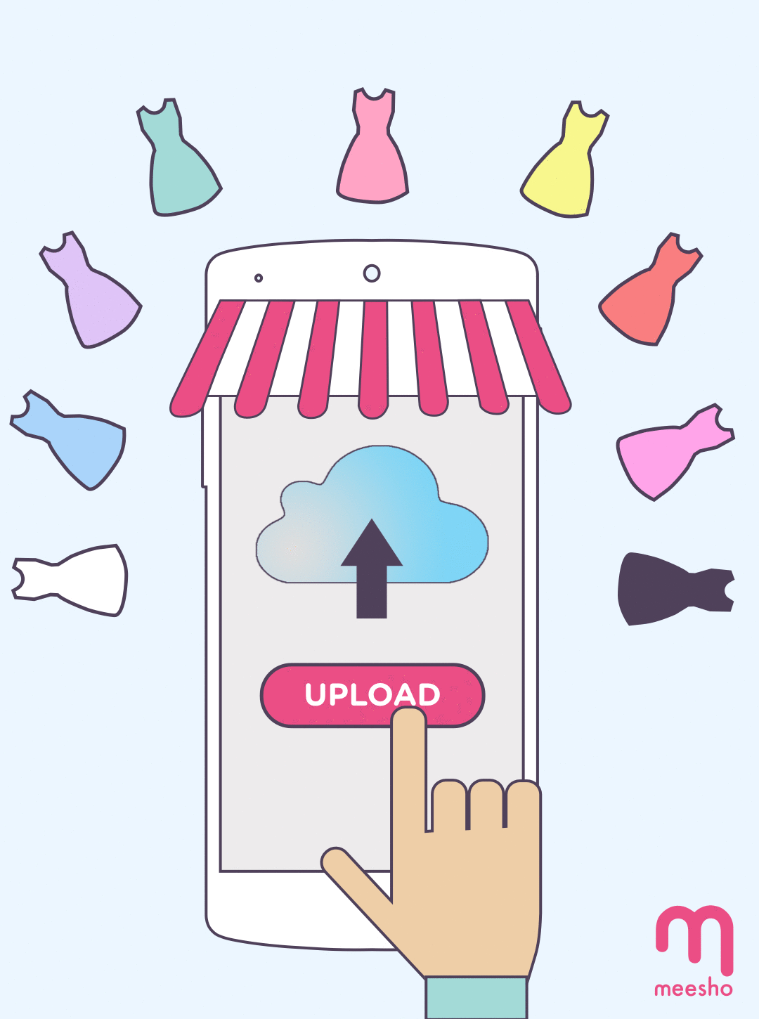
I changed some elements to create a completely new look while retaining the identity of the brand image.
-
The primary blue color was removed for a cleaner look. Lighter colors were used in the secondary palette which lead to a new age design theme, with borders and geometric shapes as design elements.
-
The old launcher icon and logo were changed to look more in sync with the design theme.
-
A more rounded and simplistic font option was selected.
-
I created a mascot for Meesho which the users could identify with. Meesho is a platform that caters to Indian sellers who own small businesses (mostly women). This was created following the old design theme.
View Social Media Creatives:
View Website: